


Brand
Icons
Pictogram Study for the DB Guidance System
BrandIcons
Visual order for the DB's guidance system
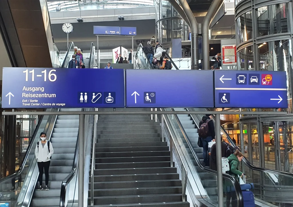
Deutsche Bahn has been using its pictogram system for decades, but it is no longer contemporary, both stylistically and functionally. R211 developed an initial pictogram study for the further development of new symbols. The aim was to achieve high recognition, improved long-distance visibility, and harmonious combinability of all symbols – for a broad and age-independent target group.
More homogeneity and better recognition
Pictograms in guidance systems often need to be displayed together, achieving a balanced overall effect. Existing systems frequently suffer from inhomogeneous area proportions, varying line weights, and inconsistent angles. R211 therefore developed an icon study that functions like a consistent typeface. The design considers recognition from a great distance and explicitly appeals to older user groups. This design allows for calm, harmonious combinations and creates visual order within the space.


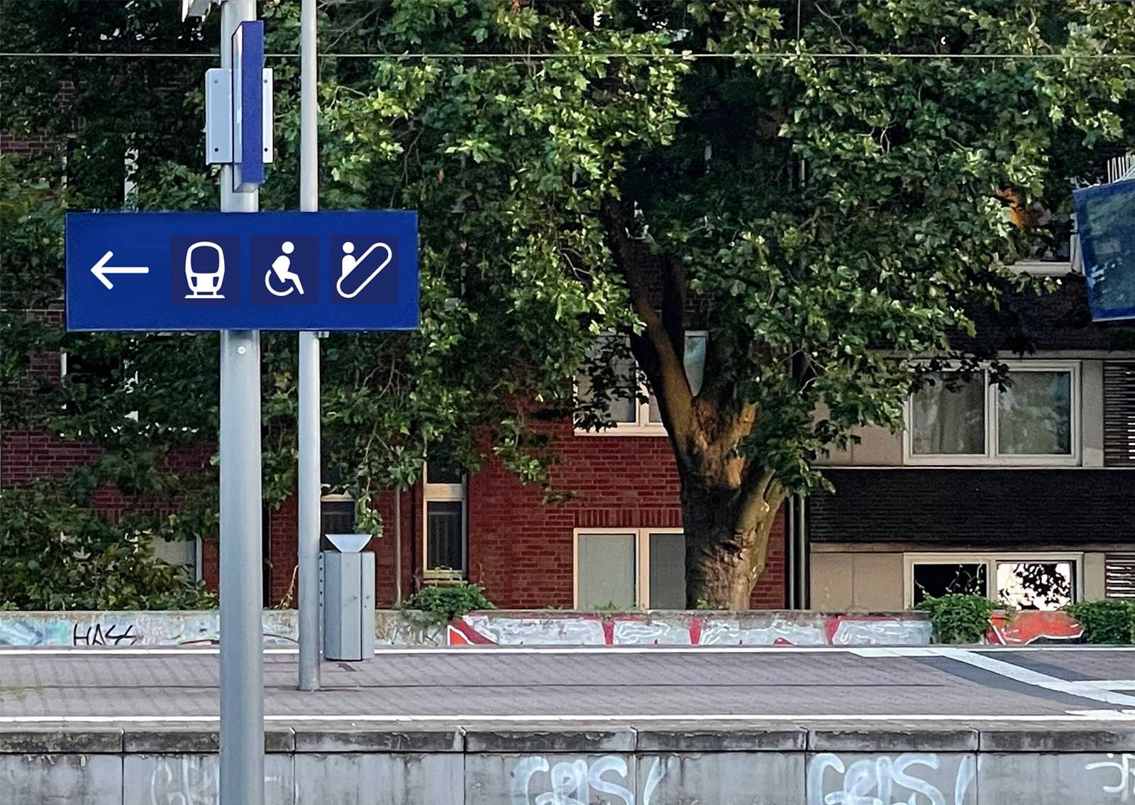
The pictogram study unites functionality and design in a contemporary manner. It respects existing user habits and considers the needs of a diverse user base. Polygonal surfaces, reduced details, and visual centering create homogeneity even when combining multiple symbols. R211’s conceptual study provides a robust foundation for the further development of the guidance system and strengthens Deutsche Bahn’s visual identity within the space.
Contact us, we are already curious about your project!
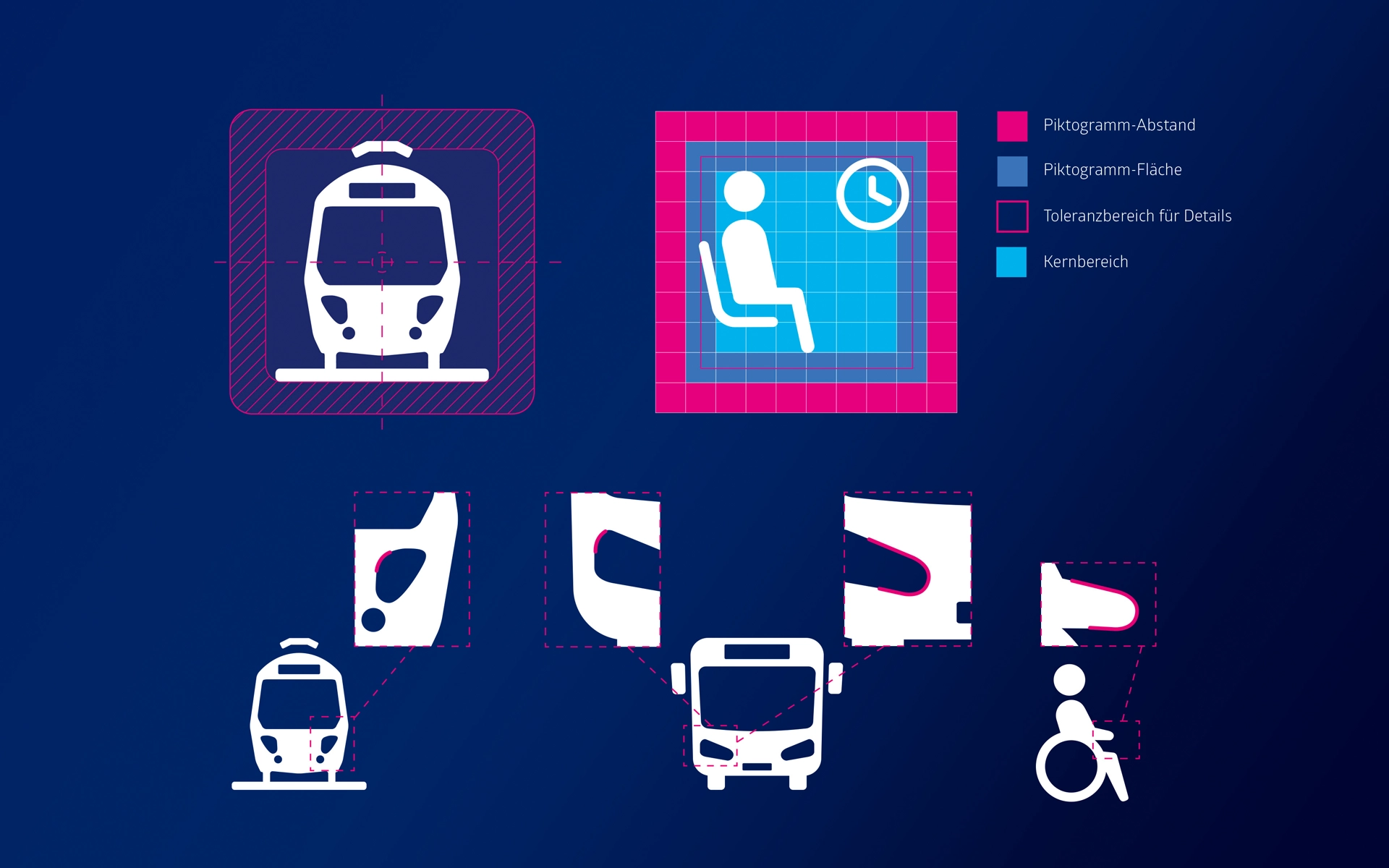


Details and studies during the development of the pictograms: Among other things, the aspects examined included area ratios, distances to edges, the handling of tolerances, and the definition of core areas within the pictogram area. A complementary study of line thicknesses—both for outlines and filled shapes—ensures consistent and legible use in the space.
Learn more about wayfinding and orientation