Logo des German Brand Award ’23 Winner auf transparentem Hintergrund
Logo des Creative Communication Award ’23 mit großer C²A-Schriftmarke auf transparentem Hintergrund.
Logo des Red Dot Winner 2022 für Brand Design auf transparentem Hintergrund

Rebranding
nursing school

A Corporate Design that appeals to young people

Rebranding
nursing
school

A Corporate Design that
appeals to young people

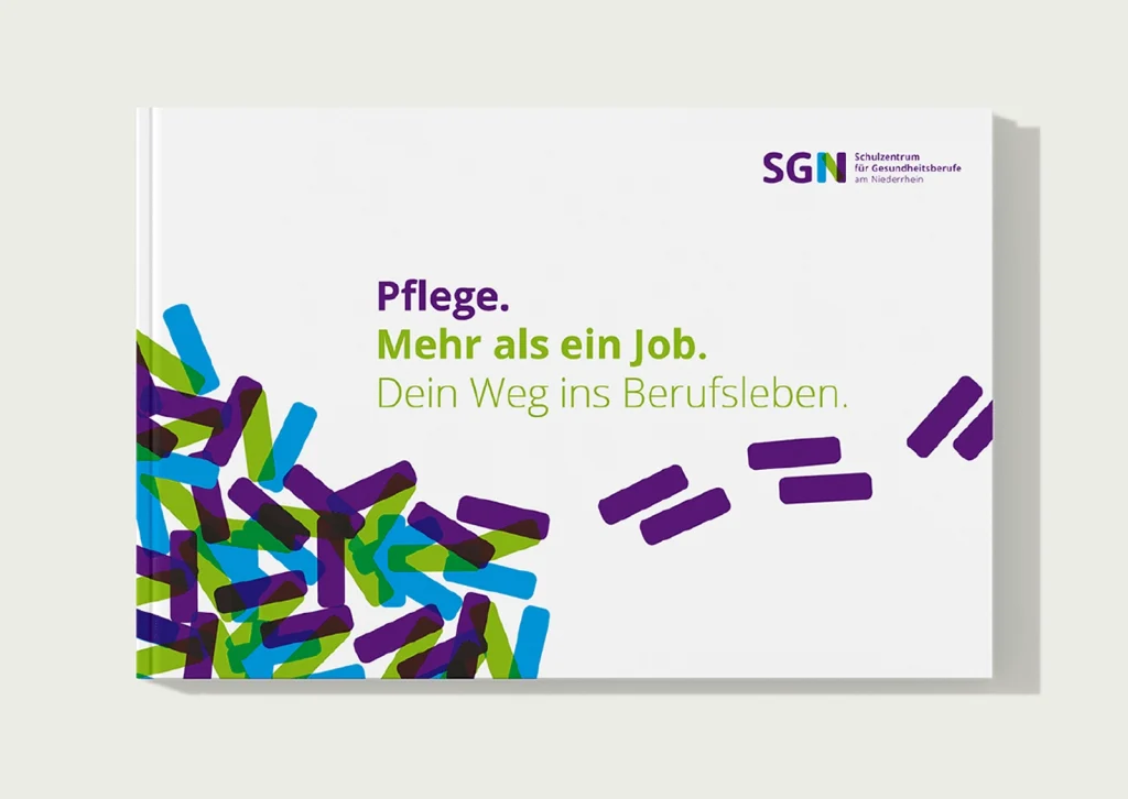
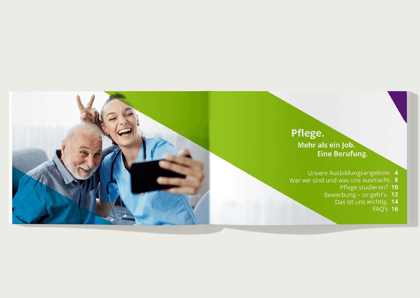
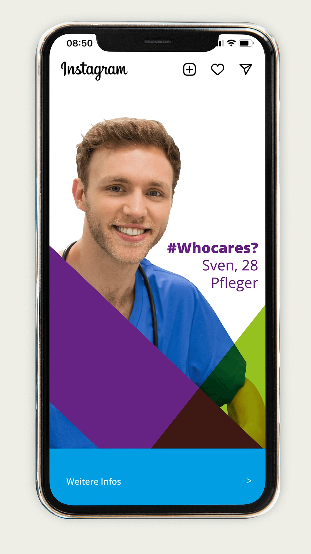
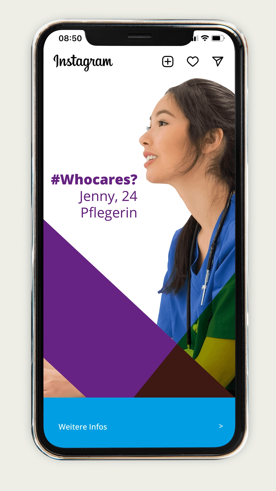
The SGN school center for health professions on the Lower Rhine offers around 200 training places as well as numerous further education and training courses. The aim of the new Corporate Design was to sharpen the profile in addition to performance and quality and to strengthen the positioning as a modern, reputable educational institution. After a thorough analysis, R211 developed a distinctive appearance – from typography and design language to imagery. The logo has been simplified and optimized for all media. Graphic elements derived from the logo ensure a high recognition value in digital and printed formats and appeal in particular to young target groups.

Flexible design system for uniform communication

The new Corporate Design enables consistent communication with simple implementation. With clear design elements, variably applicable and without complex specifications, the SGN can flexibly prepare content for different channels. This balance of simplicity and recognizability is an essential factor for successful brand management – especially in the education sector with diverse target groups.

Broschüre mit dem Titel „Pflege. Mehr als ein Job. Dein Weg ins Berufsleben.“ in lila und grüner Schrift, buntes grafisches Muster links, oben rechts Logo des Schulzentrums für Gesundheitsberufe am Niederrhein (SGN)Ansicht der neuen Geschäftsausstattung für das SGN – Schulzentrum für Gesundheitsberufe am Niederrhein, farbenfroh und modern gestaltet für eine junge Zielgruppe. Rebranding-Konzept und Umsetzung durch R211-Agentur.
Aufgeschlagene Broschüre, links Foto einer jungen Pflegekraft in blauer Kleidung, die mit einem älteren Mann ein Selfie macht, rechts grünes Gestaltungselement mit dem Titel „Pflege. Mehr als ein Job. Eine Berufung.“ und Inhaltsübersicht

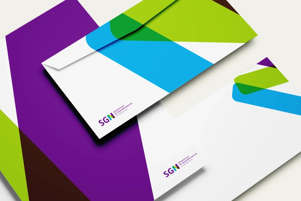
The newly developed Corporate Design allows the client a high degree of flexibility in the design, but remains simple and without complex design specifications. This is the challenge with good brand work. R211 has succeeded in developing a variable, modernly designed system and thus establishing unmistakable communication with a high recognition value.

Contact us, we are already curious about your project!

Leuchtplakat in einer U-Bahn-Station mit dem Slogan „Pflege. Mehr als ein Job. Eine Berufung.“ darüber Foto von Pflegekräften, unten Informationen zu Ausbildung, Anpassungslehrgängen sowie Fort- und Weiterbildung, rechts oben Logo des Schulzentrums für Gesundheitsberufe am Niederrhein
Smartphone mit Instagram-Post, darauf ein junger Mann in blauer Pflegekleidung, daneben Text „#Whocares? Sven, 28 Pfleger“, unten bunte grafische Flächen und Button „Weitere Infos“Smartphone mit Instagram-Post, darauf junge Frau in blauer Pflegekleidung, daneben Text „#Whocares? Jenny, 24 Pflegerin“, unten bunte grafische Flächen und Button „Weitere Infos“

Viewers usually infer a high quality of education and training from a professional and visually coherent overall impression of an appearance. The new Corporate Design conveys seriousness and also appeals to the target group emotionally in order to build trust. The project was awarded the Co&Co Selected 2022 award and shows how design can both offer orientation and sustainably strengthen the identity of an educational institution.

Learn more about our working methods in the area of Rebranding

Pathmore Rebranding

Experience Corporate
Identity
in the Space

Designing brand spaces means making identity tangible. The opportunity lies in developing brands holistically – 360° – and using design elements in such a way that they create a functional experience beyond pure form.

PathGo to article

Corporate
Design –
more than
a logo

Create cross-channel added value for your brand with a flexible Corporate Design. Because well-developed brands are visible even without trademarks.

PathGo to article

Full
Thinking
Agency

Thinking strategically ahead instead of just implementing. Communication gains its strength not from individual trades, but from their connection. Anyone who only thinks in terms of implementation risks breaks at the interfaces – especially when several specialized agencies are involved.

PathGo to article

Social
MEdia

Companies today face the challenge of thinking strategically about communication – between short-term performance, sustainable brand building and effective storytelling.

PathGo to article
abus kransysteme
amtico flooring
Athletic Archery
DHL Group
Huelsta
Deutsche Bahn
Stiftung schloss dyck
Deutscher Volkshochschulverband
Zwilling J A Henckels
Staedtische kliniken moenchengladbach
Igepa group
Hairhaus
abus kransysteme
amtico flooring
Athletic Archery
DHL Group
Huelsta
Deutsche Bahn
Stiftung schloss dyck
Deutscher Volkshochschulverband
Zwilling J A Henckels
Staedtische kliniken moenchengladbach
Igepa group
Hairhaus
Thank you for your message! We will get back to you shortly.
Please check your inbox!